
Identity | Editorial Print
Typo Berlin
Design a typographic word mark for a fictional type conference called Typo Berlin.
When I was thinking about Berlin, the Berlin wall was the first thing that popped into my mind and I remember there were many graffitis/writings on the wall. The second thing that popped up is their history which was strict and confined. So I decided to use a strict square styled font with a bleed out treatment like textures from the wall.
I wanted to give both regular and irregular feelings in the word mark.
Program Used: InDesign, Photoshop
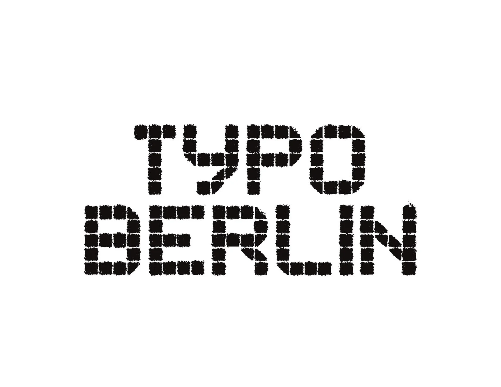
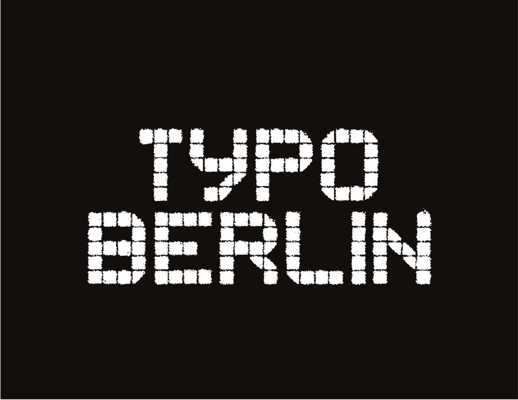
The concept of the poster relates to the bleed out effect from the word mark. Pixelated texts gathered in one spot which is like the conference: People meet in one place.